America250 logo: a project with 330 million critics

December 11, 2023
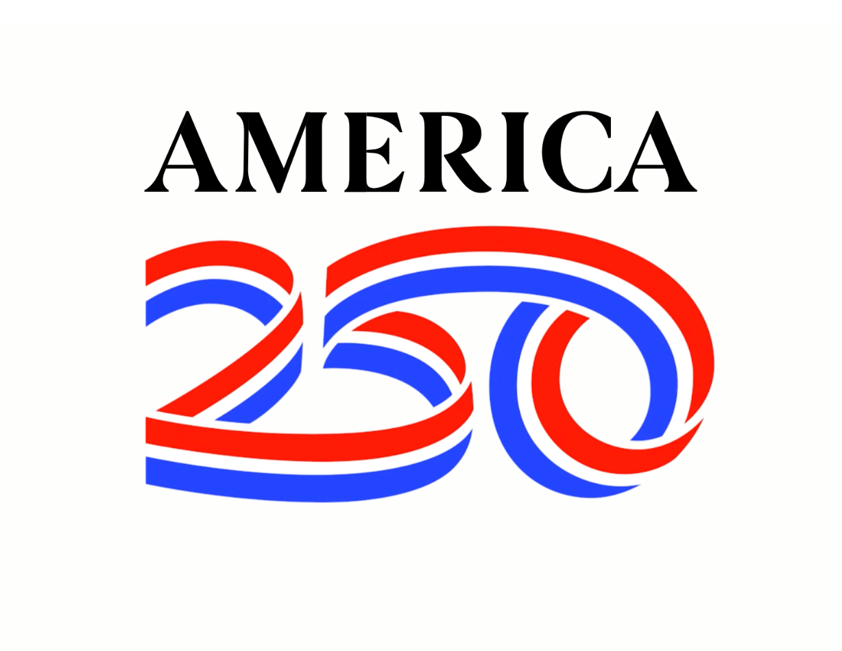
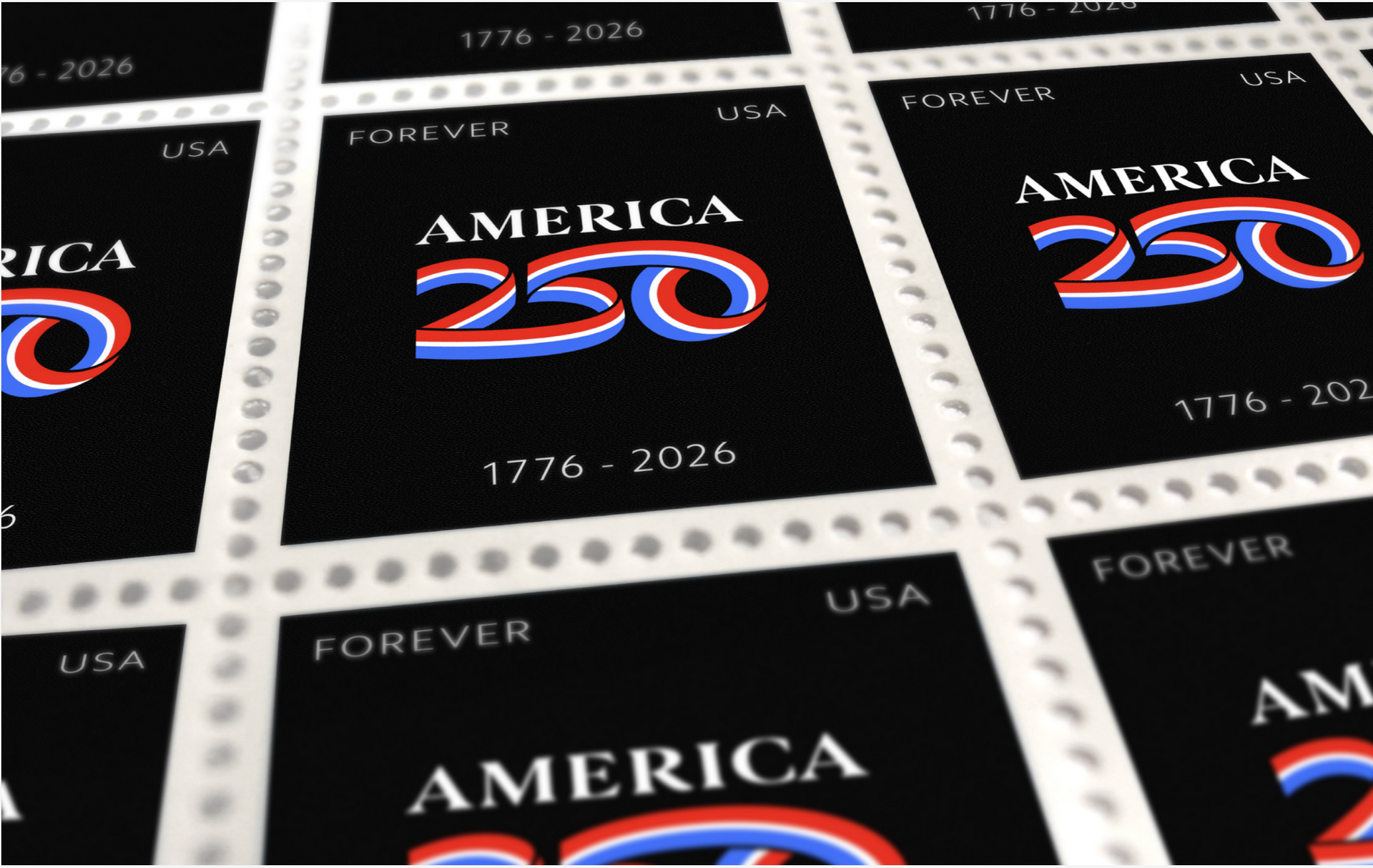
Here is Chermayeff & Geismar & Haviv’s new logo for America250. This is a project that most designers would kill to be awarded, but I bet the administrative logistics of getting it approved were difficult, if not a total nightmare.
The logo, to me, is reasonably attractive and certainly functional, but not a whole lot more. The ribbon concept makes sense culturally. The “5” looks a little awkward, but is still readable. The red and blue are both vibrant versions of those colors. It all reverses out of black very well.
This type of project is always a tough assignment because the designers probably received a lot of “notes” from their client (The U.S. Semiquincentennial Commission appointed by Congress in 2016) during the design review phase. Trying to please all the various constituencies — aka “design by committee” — on a job like this can be soul crushing. But they did a decent job: C+/B-
Back in 1976, Chermayeff & Geismar designed the Bicentennial logo. Founding partner Tom Geismar is still around at age 92, but it’s doubtful he had any role in designing this new logo.
https://www.cghnyc.com/work/project/america250

Reston, VA 20191


